Thursday, 14 February 2013

Alzheimer's Project

An idea that I have had for the theme of stories is a Granddad's child hood or story and what things were like for him when he was younger in black and white, then photos of what things are like now with technology and bright colours representing the child now a days.
         To show this as a piece of work I thought I could link it to my triptych work at the start of our stories project. I could have a photograph of the Grandad with the Grandchild in the middle, then on the left I could have an old book with stained pages with the black and white photographs for the Grandad. On the right I could have a computer screen or tablet with the bright, colourful photographs to show what things are like now for the Grandchild. I thought that I could try to show things like transport, communication and technology.
       I went to a place called Walford Mill in Wimbourne to take some photos in black and white because I had heard that it was an old area with some old buildings. When I got there, most of these buildings had extensions on them, posters and advertisements over them so I had to find different angles to cover these to make the photos look old. This ruined some of the photographs because I could not get the right angle for the image.
        When I arrived there I noticed that the area had been modernised and there was only a few buildings that I could take photographs of.
         This photo was around the back of a cafe so they hadn't updated this area yet. I had to try to move around to stop the tree taking up most of the photograph.

                                               
I found an old mangle next to a river just outside a house so I tried to take photos of this, however, my lens does not have a good enough zoom so I had to crop the photo down to get a clear photograph of it.


After moving around trees, bushes and climbing on posts, I could only get a two clear angles where I was close enough to zoom and get sharp photos.


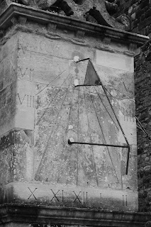
I thought about technology and how I could show this change and when I saw this sun dial I thought that I could show the difference in how we tell the time with new expensive watches, phones and computers.


I saw an old lamppost through a bush and thought that I could use this bush to frame the lamppost.


Whenever you see an old fashioned film there is always that moment when somebody walks or cycles across a bridge and this old bridge reminded me of this so I took some photographs.


I realised some people were crossing so I waited until they were in the middle of the bridge and there were no cars crossing. After taking this photograph I have thought I will not use it in the final project because I will try to keep more of a constant theme in the photographs by not having people in the old photographs.


For the middle image in the triptych I had two ideas. Firstly, I thought that I could have the Granddad telling the Grandchild a story from an old book maybe on the Granddad's lap or when the Grandchild is going to bed.
The other idea I had was the Grandchild and Granddad sitting next to each other and the Grandchild showing the Granddad photos of a holiday on a tablet or phone or showing a new game and the Granddad looking confused.

However, when I attempted to try this project, I realised that I have no close family or friends that would be young enough for this project. I decided to change my project to Alzheimer's disease. This idea came from the previous project because I did not want to waste the photographs that I had and I did not have much time to create a completely different project. I kept with the theme of old people and thought of my     Great-Nan who has Alzheimer's disease. I thought I could try to portray her blurred image in a small book. I went to places that I remember us going to and places similar to events that happened in her life. I made these photographs blurred to show that she cannot properly remember the things, only some significant events.
I started by going to her care home to take photographs of her. This was challenging because I could not ask her to pose or read the book I gave her because she did not understand what I was telling her.


I then moved on to going to places where I remember going with my Great-Nan and Great-Granddad. I used to go to Tuckton all the time with them so I went there. I wanted to find an old man to act as my Great-Granddad, however, because it was a cold day, there was almost nobody out. I then made my way to Christchurch when it was a bit warmer and found somebody to use. I tried to make the image look like the man was reminiscing and that there was something missing.


I remember walking through Fisherman's walk and playing with my cousins and Great-Nan and Great-Granddad at the bandstand and we would feed the squirrels. Unfortunately, I could not get to Fisherman's walk so I found this one in Christchurch.
Whenever it snowed my Great-Nan would tell stories of how she would have to walk to school for miles in knee-deep snow. 


 I went to Beaulieu Motor Museum to take shots of old cars and replicas of old shops. There was one car where we were allowed to dress up and sit in it so I used to and blurred out the man's face  to show that she doesn't remember him.


Stories

In our lessons we have been given the theme of stories. This could have a variety of meaning for example teaching and learning from stories or to inform future generations of events that have happened. I researched Egyptian hieroglyphics and found out about the Rosetta Stone. It was found in 1799 by a group of french soldiers. It is believed that it is a way of translating the hieroglyphs, however nobody knew how to speak ancient Egyptian for eight centuries so did not know how to pronounce or say any of the words. The stone was inscribed with a decree that is split into three languages ancient Egyptian, Demotic script and ancient Greek, but with the same meanings. The decree established the cult of the new ruler. This is very much like what Hitler did, making sure his is the only story so everybody listens to him.


I also researched an artist named Thomas Allen. He finely cuts out pieces from books, encyclopedias and old school books to create 3D shapes that creatively tell stories. I like his photographs because of the creativity, detail and care he takes in every project that he does.
                                   

He gets many of his ideas from magazines and books that he has seen with examples that he could use.
                                                 

I like the way he changes some of his images just by adding a creative title, for example, one of his images was a dog with mechanical work as its body. This confused me and I did not understand why it was there until I saw the title, 'Watch Dog' which I found funny and clever.


In the lesson I tried some experiments with a book and trying to photograph the book in different ways to see how I could portray the book. I started in the dark room and trying a variety of shutter speeds to get the correct lighting.
I then ripped part of a page and lifted it to see if it would create a shadow or change the light.

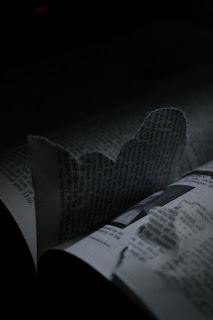


After I came out of the dark room, I was trying to think of other things I could do with the book so I searched through some of Thomes Allen's photos and found one of the corner of a book with a sentence highlighted.
                                      

I thought that I could try something similar to this and opened the book on a random page and circled powerful and strong words such as 'life' with a red pen. I started by only doing the bottom corner of the page but gradully did more so I did the bottom third with all the columns however I folded two of the pages so the three columns were from different pages.


Adde Adesokan

I researched a street photographer called Adde Adesokan. I enjoy looking at his photographsAfter looking through some of his images, I found that in many of his photos it shows emotion and you get a variety of feelings from the photographs.
When I saw this photograph I immediately thought of loneliness and sadness. I think this is because of the lighting, use of shadow and positioning of the man and how he is looking down at the floor which often represents the man being upset.


The next image made me think of curiosity and also being frightened. It reminds me of when a child has done something wrong and is hiding from their parents. It also reminds me of when my brother would chase me and I would slowly sneak back into the room. Along with many of his photographs it makes me think of loneliness. The way the light is used in this photograph changes the way the eye is lead around the image. Without the strong light on the girls faces with darkness surrounding her then the eye might be lead to what the girl is holding instead of the facial expression of the girl.
                                     

Many of his photographs use the idea of the unknown by covering peoples faces with an object or darkness which creates the feeling of sadness or loneliness. It also takes away the distraction of faces because they can change the focus of the image so people look at the face instead of the person or what the intention of the photographer is.


London Trip


We went to London on a school trip for a day. We visited the Saatchi Gallery and the Tate Modern. We started by visiting the Saatchi Gallery. I enjoyed going there and whilst I was there I tried a mini experiment of trying to keep the camera in the same place and taking a photograph of the room every 10 to 20 seconds.
I thought that this worked well, however, if I tried this again, I would try to use a tripod and keep the same time difference between each shot.


I did take more photos however I selected these because they showed the change over time and I liked how  the series of images finishes with only one person in the photograph creating a feeling of isolation which goes with the plain black clothes in the white room.

When I walked around the gallery I spotted some cardboard cut-out artwork of people. I thought of the work we did about Stephen Gill and his project of taking photos of the back of billboards so I tried this by walking around the back of the cardboard and taking photos.


Next time I would make sure there were no distractions from the subject in the back ground, I would have done this however I could not see this until after I left and was looking back through the photos. 

I took some photos of peoples reactions to photographs or what they are doing when looking at the artwork.
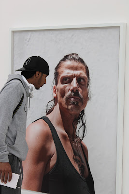


When taking the next photograph I had the intention of taking a photo of somebody taking a photograph of somebody else capturing the image on the wall. However, when I looked back at this I noticed that the positioning of the people changed the way they look so it is as if the first person in not photographing the second person.


Towards the end I walked in to one of the rooms that was very loud and noisy so to show this in my picture I used a slow shutter speed to represent chaos.
                       

The Tate Modern

          The Tate Modern had a different type of artwork in their Turbine Room this year. It was performance art with paid performers to interact with visitors and move around and sing in obscure ways. Tino Sehgal Created this exhibition and choreographed it using movement sound and conversation.
          Around the Turbine Room some of the actors would come and talk to visitors and tell them a story. I thought that I could use these stories and try to create a photography project from the topic of the story for example, the first story I was told was about the man when he was in boarding school and throughout the story he kept repeating 'split-second decisions'. I thought about this theme of decisions and thought of how people make decisions by flicking a coin. I used a 10p coin because of the smooth shape and it is shiny. I used a black background with light shining from the left hand side because the shutter speed was so high. I used manual focus and flicked the coin in front of the camera whilst attempting to photograph the coin sharply in mid-air.


However when I was flicking the coin, in many of the photos my hand was in the image and it was difficult to judge if my hand was in the image when flicking the coin.


It was also difficult to get the right shutter speed to stop the coin being blurred and to flick the coin the right distance away from the camera to keep the focus. To try to solve this I made the shutter speed higher and the light closer to try to keep the same lighting.
                        
This helped with the sharpness of the coin but there was not enough light. I decided to make my shutter speed a bit slower again and used two coins to see if I could capture both coins in the air.
                       
Because I was having to try to get both coins in the picture I could not get many good, clear photos and I was running out of time because the lesson was about to end.
     I also tried flicking the coin in front of the light. This created a silhouette of the coin and was different from the other photographs because it changed from a bright coin with the dark background to a dark coin with a bright background.
                        
I prefer the first images because they gave detail of the coin where as the silhouette just looks like there is a hole in a piece of paper.
    After going to the Saatchi Gallery, I still had the idea of long shutter speed in my head and thought that I could try this to capture the movement of the performers.
                        
To keep the camera still I had to rest it on the floor because I did not have a tripod with me. Because I was on the floor, I thought of capturing the movement of feet as the performers walked around me.


When the performers were running around, I noticed that they would go in groups and chase one of the people in that group. I tried to show this with a fast shutter speed instead of the slow shutter speed that I was using earlier.
As I looked around the museum I  found a small room where two projectors where facing each other to create different shadows on the opposite walls when people walk in to the lights. This was challenging to take photos in because of the dark lighting with the bright projections so I placed the camera on the floor and rest the lens on my phone so that I could see the lights rather than all of the floor.


Triptychs

The Red Balloon

In my lesson I was given a photograph and had to create a triptych using this image. The photograph I got is of a red balloon on by the water side. I went to a local party store and bought some red balloons and walked to Hengistbury Head to look for inspiration. As I walked around I had the idea different varieties of people on a bench such as older couples and younger couples. I realised this would be difficult to link to the original image so I took some photos and moved on. I had the idea of the story of how the balloon got there or where it has travelled from. After experimenting with a variety of images I eventually came up with a triptych.
                          
I used these two photographs because I feel they create a story and a journey. The final image was the after affects of my neighbour's dog getting the balloon and when I saw this I instantly thought I could use this as the final image in my triptych. The first image I had planned when I bought the balloons but doing this meant I only had one chance to capture as many photographs as possible.


I also had the idea of the balloon landing in a tree then moving on to the given image. However, I felt this could not work with the other images.
                          

Split Triptych

In our lesson we were given a piece of card each that had three rectangles cut out of them. We had to try to use this to create a triptych with three different subjects in them so it did not look as if they were together. Me and two classmates walked around part of the school for look for inspiration and ideas. We started by getting the focus right on the camera so it focused on both the frame and the subject behind. To do this I had to change the camera and lens to manual and change the aperture and shutter until everything was in focus. We realised as we were walking along the path that we could use this as a triptych with the rock, stones and pavement.
                        

To link the three together we scattered some of the stones on either side. We used the intersections of the card so cover the lines where the subjects join each other.

The Beach Huts

When I went to the hospital I saw an image on the wall of a single beach hut and I liked this photograph. I remembered that there are some new colourful beach huts near where I live so I went there after school to try different ways of making a triptych using the beach huts. I edited this in Photoshop to align the images to make them fit together. To do this I made the image appear like steps and gradually get larger.


I tried a series of experiments with spacing and changing the order of photographs to change the composition of the triptych and where the eye is lead.


The Painted Traffic light

Flowing

I the idea of traffic lights as a theme for a triptych. I wanted to use this theme however create something more abstract or different. I thought of the colours and how I could use paint. When thinking about what I could do with paint I realised how it flows and that I could try to make a triptych using this. I tried using the paint as it is falling into a bowl in front of a white canvas. I thought of doing a vertical triptych and having the colours like a traffic light (red then orange/yellow and green). Unfortunately I could not get hold of any red paint so I had to use pink. I started with the pink paint coming out of the pot/container. It would then move on to the orange paint as it flows so there would just be the paint against the canvas and then finishing with the green paint going in to the bowl at the end.


I was doing this experiment outside so I was only using natural sunlight which gave some of the shadow. Next time I would try to do it earlier in the day so that there is less shadow. Also the orange paint did not come out as I expected it to because it looks red in the photographs instead of orange so next time I would try using yellow paint.

The Wooden Manikin

I had the idea of taking photos of different parts of the body e.g. head, torso and legs. I mixed this with the idea of the paint and thought of the wooden manikins and that I could use that as the person. I thougth I could have three maninkins and cover each with a different colour and take photos of the head of one, then the chest and arms of the next and the legs of the last manikin. However to buy the three manikins would be too expensive so I bought one and out one colour on it then took photographs of the head, then with two colours I took a photo of the torso and finally with all three colours of the legs.


The Canvas

When I bought the manikin I also saw some small canvases and thought that they might be useful. I thought that I have done some experiments with the paint and still had some paint left so I thought I should use it on these canvases. I got a three paint brushes and dipped the first in the green paint. I put flicked the paint brush so that the paint would randomly fly on to the canvas. I then got the next brush and did the same on top but with the orange paint. I finally did the same with the pink paint on top to create an abstract piece of art that could be used as a triptych.